Building a Sneakers Sales & Price Evolution Report with KicksDB and Streamlit

In this guide, we'll create a sneaker sales and price evolution report using KicksDB, our sneaker database API, and Streamlit, a simple and effective plotting framework in Python.
By the end, you'll have a dashboard displaying trending sneakers along with their sales trends and price evolution. Let’s dive in!
Project Setup
Before we begin, make sure you have the following:
-
A KicksDB API Key – You can obtain one for free by making an account.
-
Python Environment with Streamlit Installed – If you haven’t installed Streamlit yet, do so using:
pip install streamlit pandas requests
Once your setup is ready, let's start fetching data.
Fetching Trending Sneakers
Before we analyze price trends and sales evolution, we need a list of popular sneakers. We'll use the Product Listing API, which returns sneakers sorted by rank (based on sales count).
Here's how to fetch the top trending sneakers:
import pandas as pd
import requests
import streamlit as st

# Fetch trending sneakers
def fetch_trending_sneakers(api_key):
    response = requests.get(
        "https://api.kicks.dev/v3/stockx/products",
        params={
            "display[traits]": "true",  # Retrieve attributes like release date
            "limit": 10,  # Limit the response to 10 products
            "category": "sneakers"
        },
        headers={"Authorization": api_key},
    )

    return [
        {
            "Name": product["title"],
            "Release Date": next((t["value"] for t in product["traits"] if t["trait"] == "Release Date"), None),
            "Retail Price (USD)": next((t["value"] for t in product["traits"] if t["trait"] == "Retail Price"), None),
        }
        for product in response.json()["data"]
    ]

# API Key (replace with your actual key)
API_KEY = "your_api_key_here"

# Fetch data and display in a table
products = fetch_trending_sneakers(API_KEY)
st.table(products)
Run your Streamlit app with:
streamlit run <file_name>.py
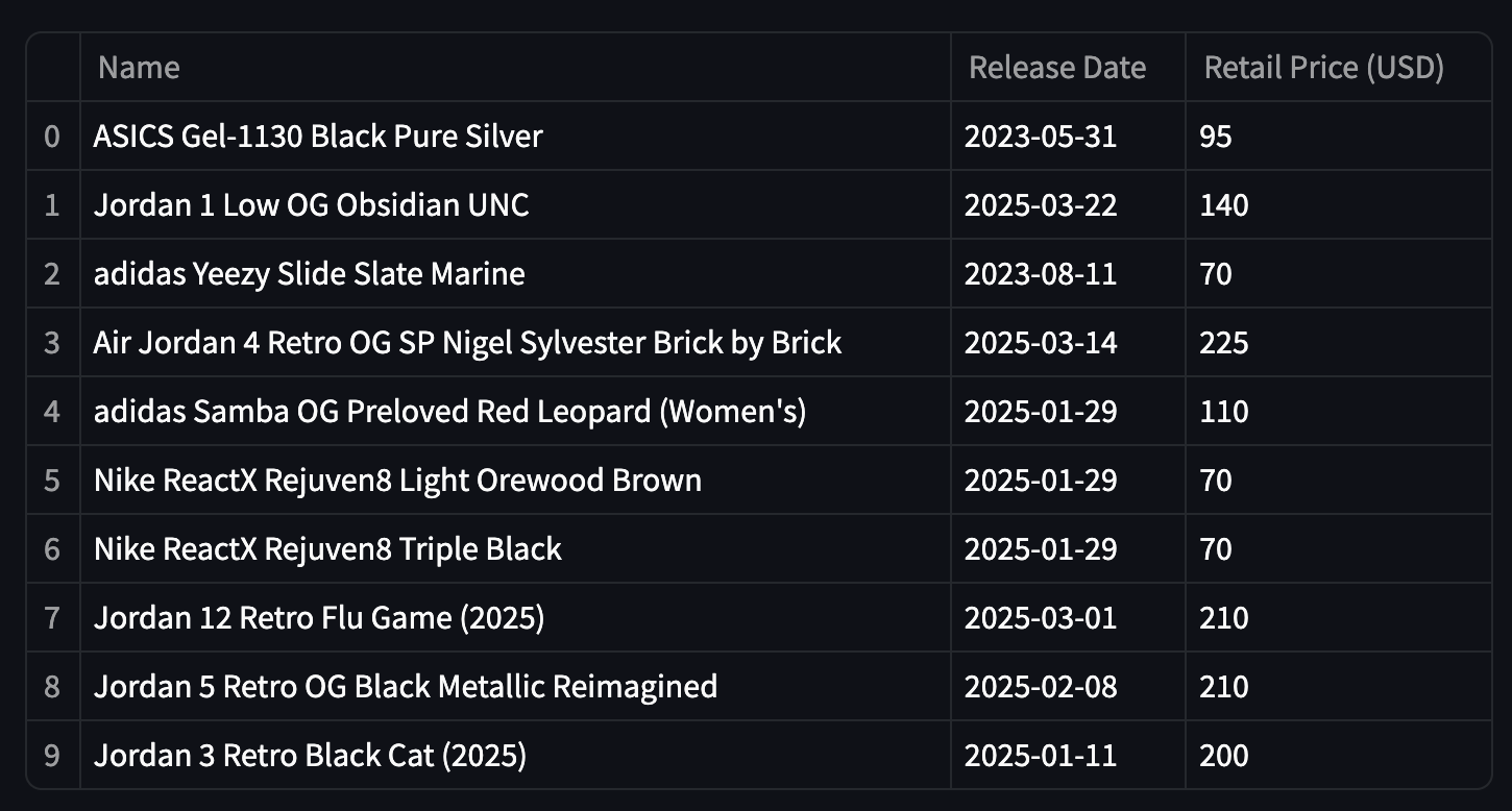
This will generate a table displaying the top 10 trending sneakers along with their release dates and retail prices.

Tracking Price Evolution
Now, let's analyze how the prices of these sneakers evolve over time. We'll use the Daily Sales API, which provides pre-aggregated sales data for each product by day. This prevents us from doing expensive computations on our side.
Add the following code to fetch and visualize sales trends:
# Fetch sales data for each sneaker
def fetch_sales_data(api_key, products):
    sales_data = []

    for product in products:
        sales_response = requests.get(
            f"https://api.kicks.dev/v3/stockx/products/{product['id']}/sales/daily",
            headers={"Authorization": api_key},
        )

        sales_data.extend([
            {
                "Title": product["Name"],
                "Date": entry["date"],
                "Orders": entry["orders"],
                "AvgAmount": entry["avg_amount"],
            }
            for entry in sales_response.json()["data"]
        ])

    return pd.DataFrame(sales_data)

# Fetch and display sales data
df = fetch_sales_data(API_KEY, products)

st.line_chart(df, x="Date", y="Orders", color="Title", height=500)
st.line_chart(df, x="Date", y="AvgAmount", color="Title", height=500)
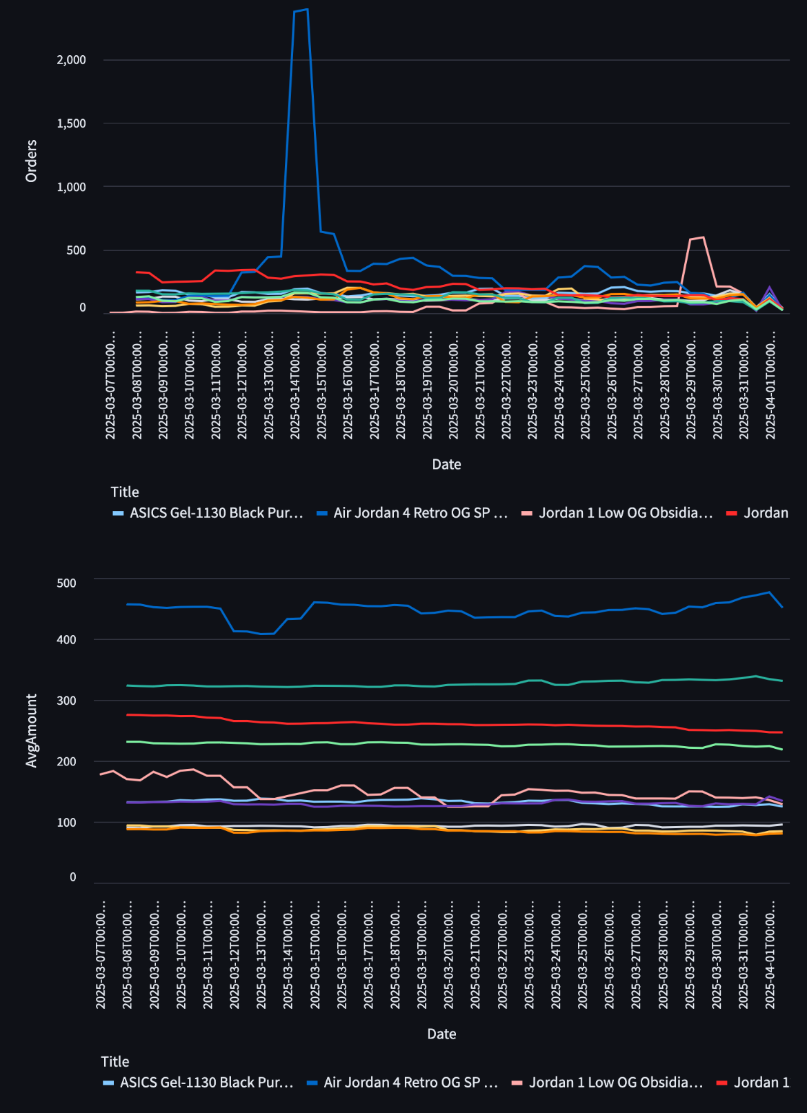
Once you reload your Streamlit app, you'll see two charts:
- Sales Volume Over Time – Shows how many pairs were sold daily.
- Average Sale Price Over Time – Displays the price trends for different sneakers.

Insights from the Charts
- The sales volume chart shows that most sneaker releases remain stable in popularity, but certain models experience sudden spikes in demand. For instance, the Air Jordan 4 Retro OG SP Nigel Sylvester Brick by Brick and Jordan 1 Low OG Obsidian UNC saw significant demand shortly after their release.
- The average sale price chart reveals that price trends are not necessarily correlated with sales volume. While most prices remain stable, some models exhibit a subtle downward trend over time.
Wrapping Up
And that's it! In just a few minutes, we've built a sneaker analytics dashboard using KicksDB and Streamlit. With this setup, you can track trending sneakers, analyze sales data, and make informed business decisions.
Feel free to extend this project by:
- Adding more data filters (e.g., filtering by brand or time period)
- Enhancing the UI with Streamlit components
- Exporting data for further analysis
Happy coding! 🚀